Brand guidelines - Version 1.0, 2023

Visual identity

Logo

This section provides guidelines on the essential elements of the Driven logo: the brandmark and the wordmark. This section provides details on available logos and intended usage.

Logo

Three versions of the Driven logo have been created for use on different materials and backgrounds.

  1. Positive
    This version of the logo should only be used on light backgrounds.
  2. Black
    This version of the logo should only be used on backgrounds that provide good contrast/legibility.
  3. Reverse
    This version of the logo should only be used on backgrounds that provide good contrast/legibility.
Download

Wordmark

Three versions of the Driven wordmark have been created for use on different materials and backgrounds.

  1. Positive
    This version of the wordmark should only be used on light backgrounds.
  2. Black
    This version of the wordmark should only be used on backgrounds that provide good contrast/legibility.
  3. Reverse
    This version of the wordmark should only be used on backgrounds that provide good contrast/legibility.
Download

Brandmark

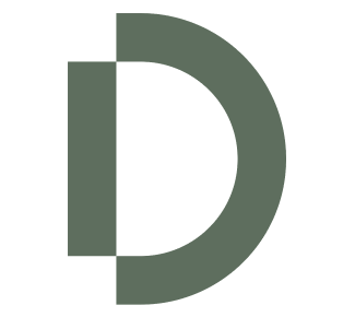
Various versions of the Driven brandmark have been created for use on different materials and backgrounds.

  1. Positive (in any of our core brand colours)
    This version of the brandmark should only be used on light backgrounds.
  2. Black
    This version of the brandmark should only be used on backgrounds that provide good contrast/legibility.
  3. Negative
    This version of the brandmark should only be used on backgrounds that provide good contrast/legibility.
Download

Exclusion zone

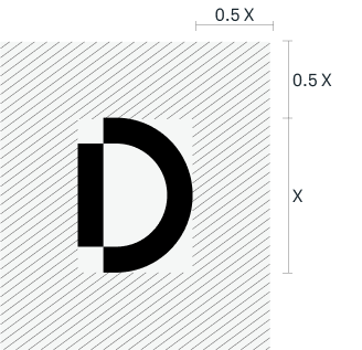
In order to protect the integrity and legibility of the Driven logo suite, an exclusion zone, or safe area, has been created around the logo into which nothing should infringe upon.

  1. Logo & wordmark
    The minimum clearspace of the logo and brandmark is measured by the height of the X. To preserve the integrity of the logo, it is important that no other logos or other graphic elements infringe on its space.
  2. Brandmark
    The minimum clearspace of the brandmark is measured by half height of the X.
  1. Exclusion zone
  2. Exclusion zone

Minimum size

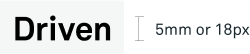
To ensure the logo always appears clear and legible, an absolute minimum size has been set.

The Driven logo, wordmark, and brandmark should never appear smaller than detailed here.

  1. Logo
  2. Wordmark
  3. Brandmark
  1. Minimum size
  2. Minimum size
  3. Minimum size

Incorrect logo treatment

  1. DON’T stretch the logo.
  2. DON’T colour the logo in any way that is not outlined in this document.
  3. DON’T edit or attempt to recreate any part of the logo.
  4. DON’T place the logo on any background that hinders the visibility or legibility.
  5. DON’T add drop shadows or any other effects to the logo.
  6. DON’T rotate the logo.
  1. Incorrect logo treatment
  2. Incorrect logo treatment
  3. Incorrect logo treatment
  4. Incorrect logo treatment
  5. Incorrect logo treatment
  6. Incorrect logo treatment

If you have any questions regarding the brand guide, please contact:

P: 07 3831 2801
E: info@driven.agency